ShopDreamUp AI ArtDreamUp


Description


Image size
1280x1024px 1.27 MB
© 2010 - 2024 monarxy
Comments26
Join the community to add your comment. Already a deviant? Log In
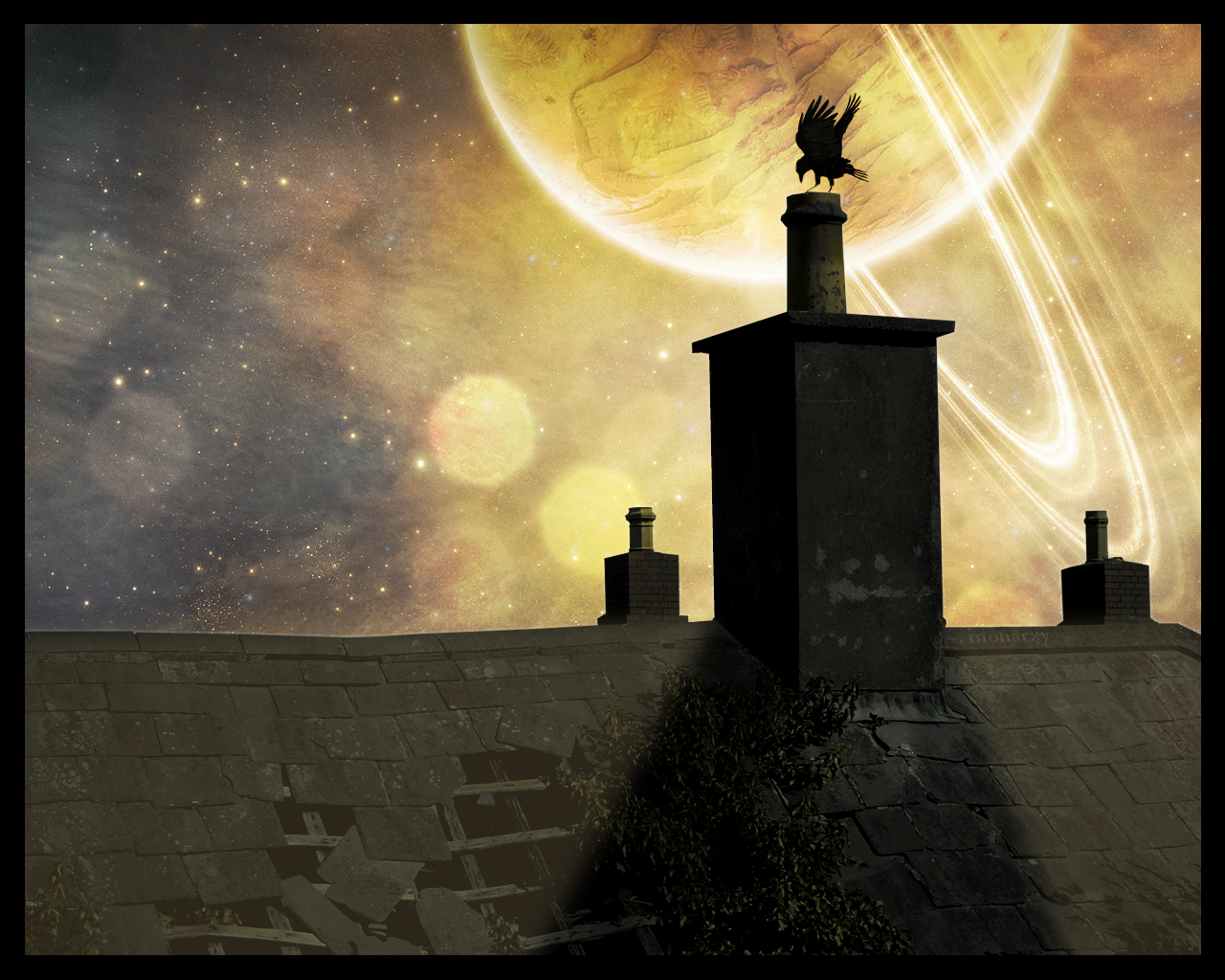
So, it's a pretty cool idea that could have had a lot more impact. The composition is good, it's simple but effective, but the illumination needs a lot more work.
The shadow and the highlights shouldn't interact this way with the plant and the broken parts of the roof. The way it is, everything seems flat.
The highlights should have a very subtle effect on the holes of the roof, it should have more effect on the borders of the holes and the wooden structure, not on the holes themselves (hope you understand xP, it's quite hard to explain). The lights should mitigate these shadows, not overlay them.
the part where the light interacts with the plants, IMO should be a bit different. Instead of just overlaying, the light should be more focused on the border of the plants rather than their whole, in order to give depth to them, they seem a bit flat.
Hope it wasn't too cofusing (Smile)")
and, of course, I hope it helps")
feel free to contact me if you need any advice!
The shadow and the highlights shouldn't interact this way with the plant and the broken parts of the roof. The way it is, everything seems flat.
The highlights should have a very subtle effect on the holes of the roof, it should have more effect on the borders of the holes and the wooden structure, not on the holes themselves (hope you understand xP, it's quite hard to explain). The lights should mitigate these shadows, not overlay them.
the part where the light interacts with the plants, IMO should be a bit different. Instead of just overlaying, the light should be more focused on the border of the plants rather than their whole, in order to give depth to them, they seem a bit flat.
Hope it wasn't too cofusing
and, of course, I hope it helps
feel free to contact me if you need any advice!